It was in January that Twitter announced that it would be rolling out a new, simplified desktop redesign to its users. Hopefully, no one was holding their breath for the big official reveal. Six months later, we can confirm that Twitter is… still rolling out tests as it tinkers with a new look for its Twitter.com desktop interface.
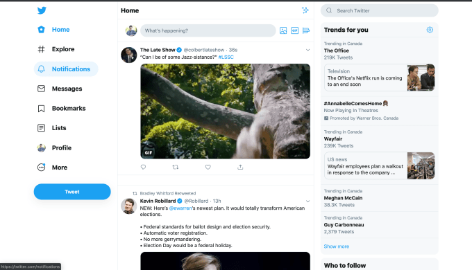
In the latest version — which appeared to get teased earlier in the year but now appears to be getting rolled out to a wider number of people (see here, here, here, a tipster who sent us screenshots from Canada, and many others) — Twitter’s desktop appears as three columns, with trends shifted to the right column, and all of the menu and navigation items (plus a link to your profile) that had been at the top now listed on the left. The timeline stays front and center.
(An earlier version rolled out in January shifted the layout to two columns, although that was a limited rollout and not everyone saw it.)
A Twitter spokesperson confirmed to us that it is currently testing new experiences in the open that it is thinking of bringing to Twitter.com, for feedback with a small set of people. He didn’t provide a date for when it will roll out more broadly, “but stay tuned.”

As you can see in the screenshots, the new look it’s testing out right now has three columns. As with other redesigns, the center continues to house the main timeline, with all the chops and changes affecting everything else around it.
In this case, all of the trending items have moved over to the right side, from their old place in the left column.
The Home, Explore, Notifications, Messages, Bookmarks, Lists and Profile are in a column, with “More” taking you to another set of options.

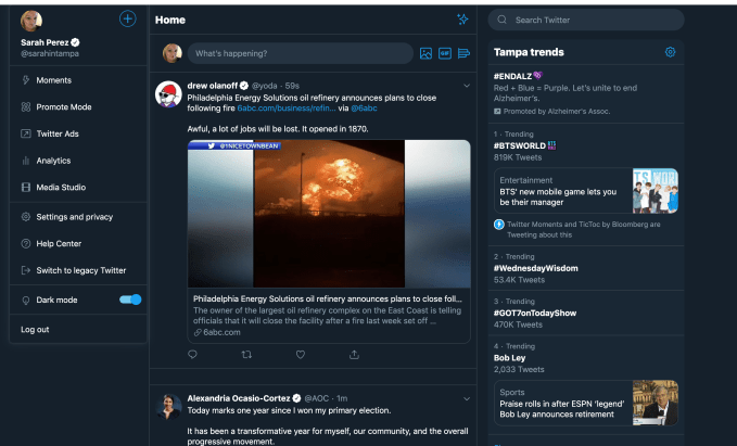
Note that Mentions, which had already had a downgrade on iOS some months ago when a Moments creation option was removed from the iOS app due to lack of use, is relegated to this second menu. But for those of you who might wonder what the point is of Mentions, the spokesperson confirmed that it is not going away altogether.
Underneath that, you get direct links to promoting and advertising, analytics, Twitter’s Media Studio, Settings and privacy, the option to switch to “legacy Twitter” and Dark mode.
So far, the responses we’ve seen to the design have been on the less enthusiastic side.
‘”What’s happening?” is the question I want answered about this #NewTwitter redesign…!,” wrote Chris Messina (a product designer who’s credited with creating the concept of the hashtag). “What is this? Google+?”
“Twitter, I do not like the new new new new new new new new new new new new UI you have on web. Please change back,” said Ken Yeung, an editor at Flipboard.
Twitter’s ongoing test mode — which has also been carried out on mobile, by way of its twttr prototyping app — is part of the company’s bigger effort to build a version of Twitter that works for everyone, or at least more people, more of the time.
One point of Twitter’s various experiments with its user interface is to try to address some of the issues the company has had with making the site easier to use for new users, and to also make it more user-friendly for those who are already there, whether it’s to make it easier to follow conversations (see Twitter’s experiments around threads), easier on the eye (dark mode introduced). easier to shut down trolls, and so on.
The reason for that is not just to be a good housekeeper: it’s to help Twitter grow.
Twitter has lately been on a bit of a high when it comes to its financials, last quarter flying past its estimates on both revenue and earnings per share. But monthly active users — a perennial issue for the company — continued to slide. (It’s a metric that Twitter will magic away by focusing instead on another one: monetizable daily active users, which were up.)
We’ll be on the lookout for more updates, but in the mean time, let us know what you think.
from Social – TechCrunch https://ift.tt/2Ncmujd
via IFTTT


0 comments:
Post a Comment